Fast Company - "Why KIA’s confusing logo is part of a growing design trend"
"The crossbar-less “A” seems to have first started cropping up in the ‘60s. In 1964, rookie designer Bart Crosby was working on his first big project, a new corporate identity for Arvin Industries, a manufacturing company based in Columbus, Indiana, a town with a budding design heritage thanks to a 1950s architecture program subsidized by local engine behemoth Cummins. For the Arvin wordmark, Crosby dropped the crossbar of the initial “A” in order to have it visually reflect the “v” in the name. “I thought it might be too radical for the client,” he recalls, “but the reaction to it was, surprisingly, that they loved it.” He had created an early, if not the first, crossbar-less “A” wordmark.
...
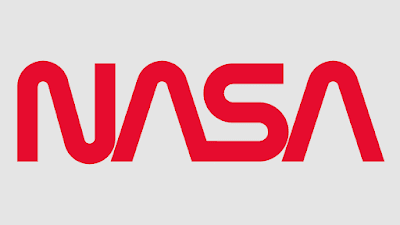
The appeal of the crossbar-less “A” seems to lie in its ability to suggest an air of futuristic high technology; its inclusion in NASA’s 1974 “worm” logo certainly went a long way in this regard. At a more basic level, the “A” freed of its crossbar transforms from a mundane, workaday letter found on every office keyboard into a symbol; a sleek chevron, a zenith, a pinnacle, an arrow forever pointing upwards. That may be why Disney went with a crossbar-less “A” for its recent Star Wars series, Andor. Using a crossbar-less “A” in a word adds an allure that is exotic and unfamiliar, which is why reinserting the bar into the Kia mark for the sake of clarity would be such a mistake."


No comments:
Post a Comment