Sunday, August 22, 2021

Brazil Tries to Make Cachaça a Global Spirit


BBC – "Brazil hopes the world will get a taste for its favourite spirit"


"...enjoy cold glasses of the country's national cocktail - caipirinha, a mixture of cachaça, sugar, and lime, with lots and lots of ice."

...

"So what exactly is cachaça? Pronounced "ka-SHAS-sa", it is distilled from sugar cane juice. This, Brazil says, makes it different to rum, which is typically made from the molasses, or thick treacle, left over after sugar cane has been processed into sugar. 

Fans of cachaça say this makes it taste fresher and fruitier than rum. 

Cachaça, which can only be made in Brazil, is believed to have been first distilled in the country in 1516. This means that it predates the production of both rum and tequila. 

It is also regarded to be the world's third most-produced spirit, after vodka and China's baijiu. 

The country makes some 800 million litres of cachaça a year, according to trade body Brazilian Institute of Cachaca (Ibrac) Yet such is the thirst for the spirit in its vast home country - less than 1% is exported."

Saturday, August 14, 2021

Malice at the Palace


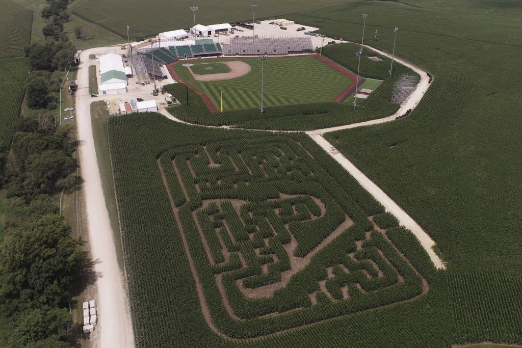
MLB's Field of Dreams Game


1946 Issue of The New Yorker


From @lesleymmblume: Guys. I have been trying to track this down forever: the original August 31, 1946 issue of the @NewYorker , which contained John Hersey’s “Hiroshima” report WITH the original white paper band ... and this treasure was just unearthed in storage at the John Hersey High School in IL

Lit Hub – "The New Yorker Article Heard Round the World"

New Yorker – "Hiroshima" (August 23, 1946) by John Hersey

The Return of 70's Fonts


Vox – "Why funky ’70s-style fonts are popping up on brands like Chobani and Glossier"

"Branding trends always exist in relation to what came immediately before; aesthetics are a powerful way for a company to stand out from its competitors, and once a particular look reaches oversaturation, it’s time to move on. Particularly in the startup space, the early 2010s were absolutely dominated by sans serifs and minimalist design, a trend that was itself a reaction to the chaotic typography of the 1990s. Now that the simple, utilitarian look has run its course, companies and branding agencies are turning to fonts with a more expressive, human feel.

Many of the typefaces that we associate with the ’60s and ’70s were actually created decades before, though they’re informing the present-day design landscape because of how they were used in the ’70s. Consider the typeface Windsor, which was crafted in 1905 and, according to the Font Review Journal, had its heyday between the 1960s and ’80s. It was famously used on the cover of the counterculture magazine the Whole Earth Catalog and in Woody Allen’s film titles, including 1977’s Annie Hall. Cooper Black was released in 1922, but in the ’60s and ’70s it made notable appearances on album covers from The Doors, Curtis Mayfield, and The Beatles.

“Stylistically, the ’70s were really exuberant and free, and also extremely diverse,” says Natasha Jen, a partner at the design firm Pentagram and the creator of Buffy’s custom logotype. It wasn’t all psychedelia and bubbly fonts: Herb Lubalin, a titan of 1970s graphic design, made looping, thick typefaces, but he also produced Avant Garde, a sharp, angular style recently used as the title card in Netflix’s Master of None."


Related,

Font Review Journal – "Windsor — Designed by Eleisha Pechey"

Previously,

Chobani's New Look (January 2018)
Pizza Hut Font (October 2020)

The "Most Significant Works of Postwar Architecture"


The Return of the Lamborghini Countach (Hybrid)


The Verge – "The Lamborghini Countach, the Poster Car of '80s Luxury, is back - and it's a hybrid"