Showing posts with label Interior Design. Show all posts

Wednesday, December 13, 2023

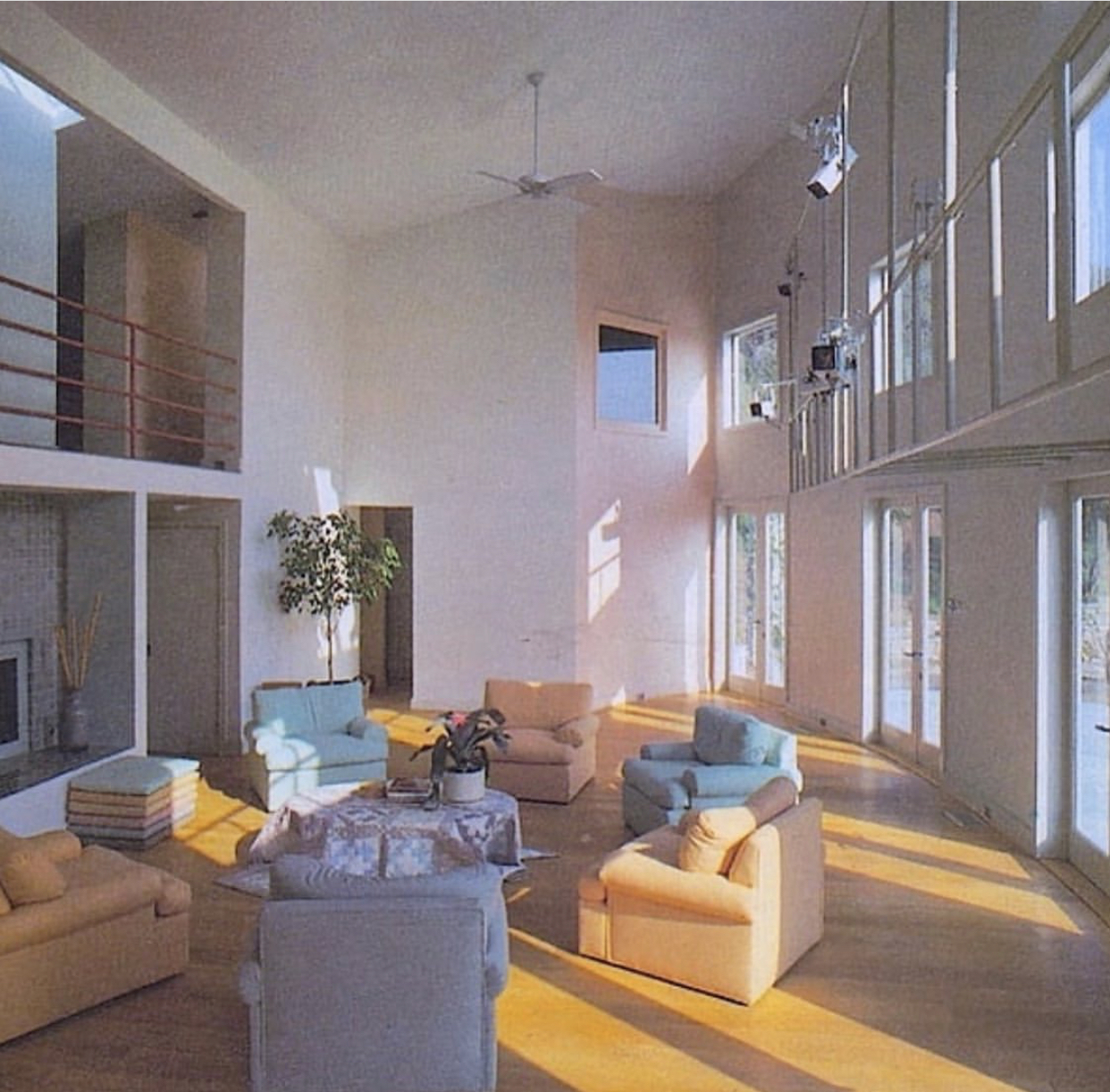
Pantone's 2024 Color of the Year - Peach Fuzz


Washington Post - "Pantone announces its 2024 color of the year"

"Soothing our fractured world sure sounds like a tall order for a muted mix of pink and orange. But in a news release, Pantone’s executive director, Leatrice Eiseman, asserted: “Peach Fuzz brings belonging, inspires recalibration, and an opportunity for nurturing. Drawing comfort from PANTONE 13-1023 Peach Fuzz, we can find peace from within, impacting our wellbeing.”"

Thursday, January 27, 2022

Themed Cubicle


From @mikebeckhamsm: Recently one of our newest team members asked if he could decorate his cubical. When I said yes, I wasn't expecting this...

Saturday, July 24, 2021

Furniture Ideas

Sunday, May 9, 2021

Wednesday, April 28, 2021

Trophy Trees


"A few years ago, Mr. Johnson had a client who beat out basketball great Michael Jordan in a bidding war over a 45-foot canopied oak tree, which Mr. Johnson deemed the ideal tree. The deal for the oak closed in the low six figures.

“You want a tree that’s balanced,” Mr. Johnson said. “With this tree, it was perfectly proportioned and had a lot of character. The way the branches went off in both directions. This was the perfect oak tree.”

The absurdity of the situation isn’t lost on Mr. Acree. He said his wealthiest clients are finance and business types whose wealth dwarfs that of movie and music stars. “If they want it, it will happen,” he said with a laugh.

Once, he got into a debate with Mr. (Enrique) Iglesias over which way a tree he was installing on his property should face; Mr. Acree thought the curve of the tree should bend away from the house, as it would in the natural world, but Mr. Iglesias wanted it bent toward the house. Against his own judgment, he did it Mr. Iglesias’s way. A short while later, the singer called to have him rotate it back, he said. A representative for Mr. Iglesias didn’t respond to requests for comment.

The appeal of transporting a trophy tree is easy to explain, said Raymond Jungles, a Miami-based landscape architect. For one, a big tree helps mitigate the scale of a very big house. A unique or particularly old tree, like a piece of art, is also a great conversation piece. Lastly, it means high-net-worth buyers don’t have to wait for a newly planted tree to grow on their site."

Saturday, December 12, 2020

Pantone Colors of 2021: Ultimate Gray and Illuminating


"The prognosticators began by acknowledging the shades of gray in which we have all been immersed. Indeed, of all the grays in the palette, Ultimate Gray is a determinedly neutral kind of gray. It is not the dark gray of gathering storm clouds or the dour gray of institutional sameness or the dim gray of skulking in the shadows or the soft, luxurious dove gray of Dior, but a more solid, granite-like gray. The kind of gray of wisdom (gray beards!) and intelligence (gray matter!) and construction.

“It’s a dependable gray,” Ms. Eiseman said

One person’s dependable is another person’s depressing, however, which is where Illuminating comes in. It’s not the egg yolk-like yellow of Mimosa, the color of the year of 2009, nor an acidic or highlighter yellow, nor the “go into the light” yellow of the afterlife, or sci-fi adventure, but more of a sunshine, or smiley face, yellow.

Together, Ms. Eiseman said, “the color combination presses us forward.” It has been popping up everywhere, from Nike to the Marks & Spencer Pornstar Martini cans."

Previously,
Ultra Violet (December 2017)
Greenery (December 2016)

Ikea Ceases Printing its Catalog


From Morning Brew on Dec. 8:

While Nicolas Sparks is proof that books can make you cry, turns out catalogs can bring on the waterworks, too. Yesterday, Ikea made the "emotional but rational" decision to discontinue its iconic furniture catalog after a 70-year run. 

The backstory: A mainstay of coffee tables everywhere, the notoriously thick lookbook is said to be the most widely distributed publication in the world—even more than the Bible. At its peak, Ikea produced 200 million copies in 32 different languages.

But the Bible doesn't compete with e-commerce. Online sales (up 45% last year) have become increasingly important to Ikea's business, and customers just weren't using the paper catalog as much as they used to.

Bottom line: Online furniture sales have been a pandemic winner for retailers like Wayfair and Amazon, so Ikea's decision to focus on its digital operations makes business sense. Just don't get rid of the meatballs.

+ While we're here: If you're feeling nostalgic, visit the digital Ikea museum to leaf through decades of past catalog issues.

Previously,
Vintage Ikea (August 2020)
How to identify an original Ikea Frakta bag (April 2017)

Monday, May 25, 2020

Top Stubborn Design Trends


New York Times – "9 Top (and Stubborn) Design Trends"

Subway Tile

"White tile was a fixture in middle-class Victorian homes long before the New York City subway opened in 1904, covered in the stuff. Unlike fancier, colorful tiles applied to fireplace surrounds and hearths, glazed white tile appeared in high-traffic areas like kitchens and bathrooms, offering durable surfaces that made dirt conspicuous and were easy to clean.

Transferring the same hygienic principles underground, the subway station designers Christopher Grant La Farge and George L. Heins created a huge, elaborate canvas for white field tile installed in a running bond pattern edged in coves and other trims. The three-by-six-inch rectangles had a distinctive look, with beveled surfaces and narrow grout lines.

Though the color and material palettes (and even size range) have expanded, this is the hugely popular wall treatment (214,000 Instagram hashtags) we now call subway tile.

When did that term appear? Nobody seems to know.

Keith Bieneman is the owner and managing director of Heritage Tile, a company that does restoration work on New York’s subway stations, using tile manufactured to the original standards.

“There was a resurgence in artisan tile making throughout the U.S.” in the 1990s, he said. “People started focusing on the kitchen and started putting in high-end appliances and looking at backsplashes as art pieces as opposed to utilitarian surfaces.” Subway tile fulfilled aspirations for the authentic remodeling of many 20th-century homes (it had exploded in the 1920s when its manufacture and installation were standardized) and yet it looked timeless.

Another powerful influencer was Schiller’s Liquor Bar, the retro-styled restaurant Keith McNally opened on the Lower East Side in 2003. For 14 years, it dished out steak frites in a space with a pressed tin ceiling, tarnished mirrors, a black-and-white checkerboard floor and square yards of vintage subway tiles.

Schiller’s has plenty of imitators, including a minutely detailed copy called Café La Favorite on the Rue de Rivoli in Paris.

“This Jazz Age New York style, that’s something that’s admired tremendously around the world,” said Mr. Bieneman, whose company manufactured tile for La Favorite, and for Schiller’s copycats in Dublin, Stockholm and Guangzhou, China."


Bar Carts

"The bar cart, a midcentury artifact, made its return about a decade ago, a few years after “Mad Men” showed us what an asset it could be. In you took the AMC series as your model, you parked the bar cart in your living room (or better yet, office) and visited it as frequently as a diabetic zebra at a watering hole. You learned that anything small and on wheels feels friendly and informal, even when it is a vehicle for bad behavior.

Well, five years have passed since “Mad Men” ended, and the bar cart is still with us (150,000 Instagram posts). It turns out to be useful in so many un-louche ways.

Bar carts can be plant stands and end tables. Magazine holders and unused corner fillers. You can even pull them up to your open-plan kitchen for emergency counter space when you have no other place to put the roast.

“To me, bar carts signify swagger. I think that’s le mot juste,” said Jonathan Adler, who began designing them 15 years ago, before Don Draper lurched onto the scene. “If you see someone with a bar cart, you think they’re fun. They make young people seem sophisticated and old people seem young.”

He said his personal love affair began when he bought a vintage bar cart by an under-sung midcentury Italian designer named Aldo Tura, who worked in lacquered goatskin. Since then, Mr. Adler said he’s done a “bazillion” ones with different degrees of functionality and had just gotten out of a Zoom meeting discussing the development of his next.

“I’m going to do a round one,” he said. “One of the things I love about them is an opportunity to get quite sculptural.”"


Also mentioned:
Macramé
Rattan
Fiddle-leaf Figs
String Lights
Kitchen Islands
Hairpin Legs
Beni Ouarain Carpets

Sort-of related:
1960's Conversation Pits
The Millennial Aesthetic … “People are tired of the sameness and already craving something new”

Glass Brick Nostalgia

From @KatyKelleher: "Bring 👏 back 👏 glass 👏 brick!"


The Walrus – "Why Nostalgia Is Our New Normal"

"Appropriately for the elusiveness of the concept, the word nostalgia did not originally mean what we now consider it to—also appropriately, it was coined with a longing for a time when there was no word for what it described. In 1688, a Swiss medical student named Johannes Hofer gave the name nostalgia to a malady he had noticed in young Swiss people who had been sent abroad—chiefly mercenaries, one of Switzerland’s prime exports at the time, though also household servants and others who found themselves in “foreign regions.” As was the style at the time in the nascent field of “medicine more complicated than bleeding humours,” Hofer used a portmanteau from an indistinctly highfalutin form of Ancient Greek: nostos roughly means “home”—although it more often means “homecoming,” which incidentally was also the name for an entire subcategory of Greek literature, most notably the Odyssey—while algos means, more simply, “pain,” derived from Algea, the personifications of sorrow and grief, and a common classification at the time, attached to a variety of maladies that have since gotten either more precise or more vernacular names. "

Sunday, March 8, 2020

The Millennial Aesthetic … “People are tired of the sameness and already craving something new”


The Cut - "The Tyranny of Terrazzo Will the millennial aesthetic ever end?"
By Molly Fischer

"Consider a previous youth-style shorthand: the hipster, preeminent cultural punch line of the aughts. Both hipster and millennial were terms that drifted away from strict definitions (hipsters being subcultural, millennials being generational) to become placeholders for “whatever fussy young people seem to like.” It is strange, now, to remember a time when chunky-framed glasses were understood as a hipster affectation; today they just look like Warby Parker. The hipster aesthetic harked back to a grimy past: Its spaces were wood-paneled, nostalgic; perhaps they contained taxidermy. Behind lumberjack beards and ’70s rec-room mustaches, there was a desire for something preindustrial or at least pre-internet.

...

No account of the millennial aesthetic could fail to address pink: For the better part of a decade, millennial pink bedeviled anyone a color could bedevil. When Facebook rolled out a corporate rebrand last fall, the lead image in the press release showed the new logo — breezily spaced sans serif — in a muted shade somewhere on the ham-to-salmon spectrum. Samuel keeps wondering when people will get sick of the color, but they don’t; almost every client asks for pink. She thinks this is because it’s soothing. They want houses that remind them of vacations, suggest Mediterranean idylls.

...

Pink is not the only soft color in the millennial palette. There’s green, often in the form of plant life — it has a wholesome appeal next to the pink — and then an expanding array of colors simultaneously saturated and chalky, muted even when not actually pastel: seafoam, terra-cotta, lavender, and (especially) ocher. In explaining the appetite for colors that soothe, we might gesture vaguely in the direction of Now More Than Ever, anxiety, the news. A more direct explanation would probably be that other stalwart of millennial pop sociology: the phone, now the basic tool with which we view, record, and disseminate images of the world. All that time spent staring into a glowing screen makes the prospect of something gentle — something literally easier on the eye — enticing. The millennial palette is the opposite of glare; onscreen or off, it’s color softly veiled.

...

Instagrammable is a term that does not mean “beautiful” or even quite “photogenic”; it means something more like “readable.” The viewer could scroll past an image and still grasp its meaning, e.g., “I saw fireworks,” “I am on vacation,” or “I have friends.” On a basic level, the visual experience of a phone favors images and objects that are as legible as possible as quickly as possible: The widely acknowledged clichés of millennial branding — clean typefaces, white space — are less a matter of taste than a concession to this fact.

...

It is hard to imagine ourselves growing old — to imagine the time, nearly upon us already, when “millennial” no longer means “young.” Likewise, it is hard to imagine how the millennial aesthetic will age. Its blank, clean surfaces aspire to a world without clutter or scuffs, unmarked by the passage of time. In this aspiration, the millennial aesthetic is somewhat democratic — anything can be new, for a while. It is a style that looks, in its ideal state, like a purchase.

...

What the millennial aesthetic sells, it sells through the promise of novelty. This is true even when the product on offer is not appreciably novel: cat food, Dutch ovens, and generic drugs are repackaged, redesigned, as if millennial buyers required a version all their own. Jessica Walsh, a graphic designer and founder of the creative agency &Walsh, dates the style to the last five years and sees its expiration date approaching already. “Everyone wants to look like the Casper, Warby Parker, or Aways of the world,” she explains, which has made branding increasingly interchangeable. “People are tired of the sameness and already craving something new.”

When the time comes — when smooth pastels start to feel a little tacky, when brown starts looking good again — what will be saved? As in any era, most of our belongings will be lost, but fewer than ever seem worth trying to preserve. In her article “Why Does This One Couch From West Elm Suck So Much?,” author Anna Hezel asks employees in a West Elm store how long that “Peggy” couch was, ideally, supposed to last. One to three years, they inform her.

Last year, the interior-design start-up Homepolish collapsed; last month, Casper made its disappointing IPO; last week, Outdoor Voices CEO Tyler Haney stepped down amid reports that her company, based on tastefully colored leggings, was losing cash. Design created an astonishing amount of value in the last ten years, and increasingly that value looks ephemeral. I remember visiting WeWork corporate offices in early 2016 and telling a friend that the space already felt period — larded and spackled with efforts to look designed ca. 2016, which now sounds like a very long time ago. Of course, I can also look around my apartment and see what threatens to wilt: boob poster, pink blanket, plants. We have lived through a moment in which design came to seem like something besides what it was, like a business model or a virtue or a consolation prize. The sense of safety promised in its soft, clean forms begins to look less optimistic than naïve."

Previously,
Millennial Pink

Sunday, March 10, 2019

Product Design Engineering